Brand IdentityMedia & Broadcasting
ATnT360 was built to cover what generalist outlets cover selectively and international media filters through their own lens: the full value chain of Africa's aviation, travel, and tourism sector. The name encoded the mission — AT&T = Aviation, Travel & Tourism; 360 = every angle, every stakeholder, every point of the journey.
Discovery identified the core tension: the brand needed to feel like a credible newsroom AND a useful service for travellers. Neither alone was enough. The identity had to carry both without contradiction.
The Architect phase built the brand positioning around a single operating logic: rather than dressing up the name, make every element of the identity legible as a direct expression of what the brand does and how it does it. Broadcast reach + full-chain coverage + movement and momentum — three ideas that had to be visible at a glance.
Brand voice: Approachable, Professional, Authoritative. Concise, Informative, Engaging. The brief rejected both the stiff formality of legacy broadcast brands and the casual energy of lifestyle media. ATnT360 sits between them: a trusted voice with genuine warmth.
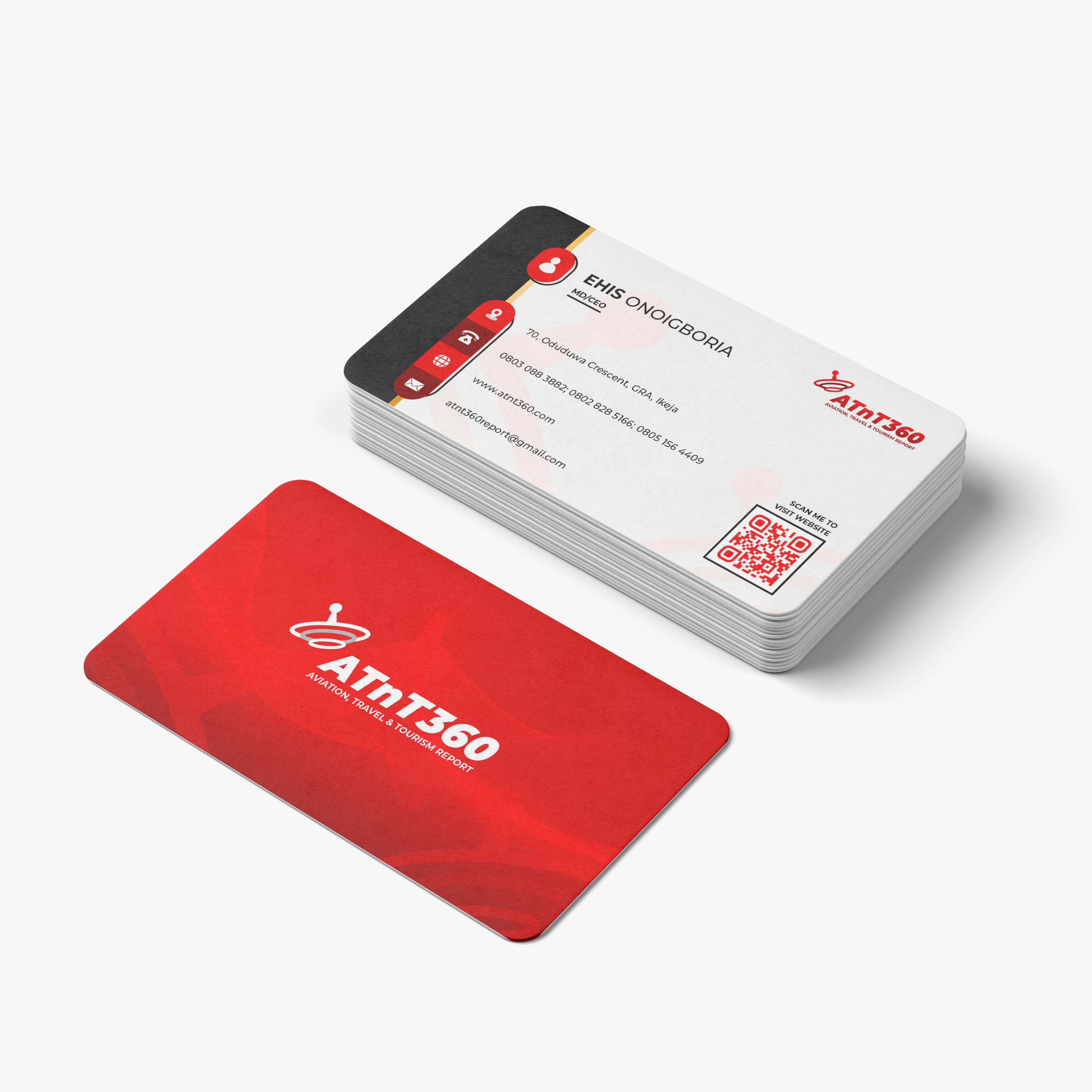
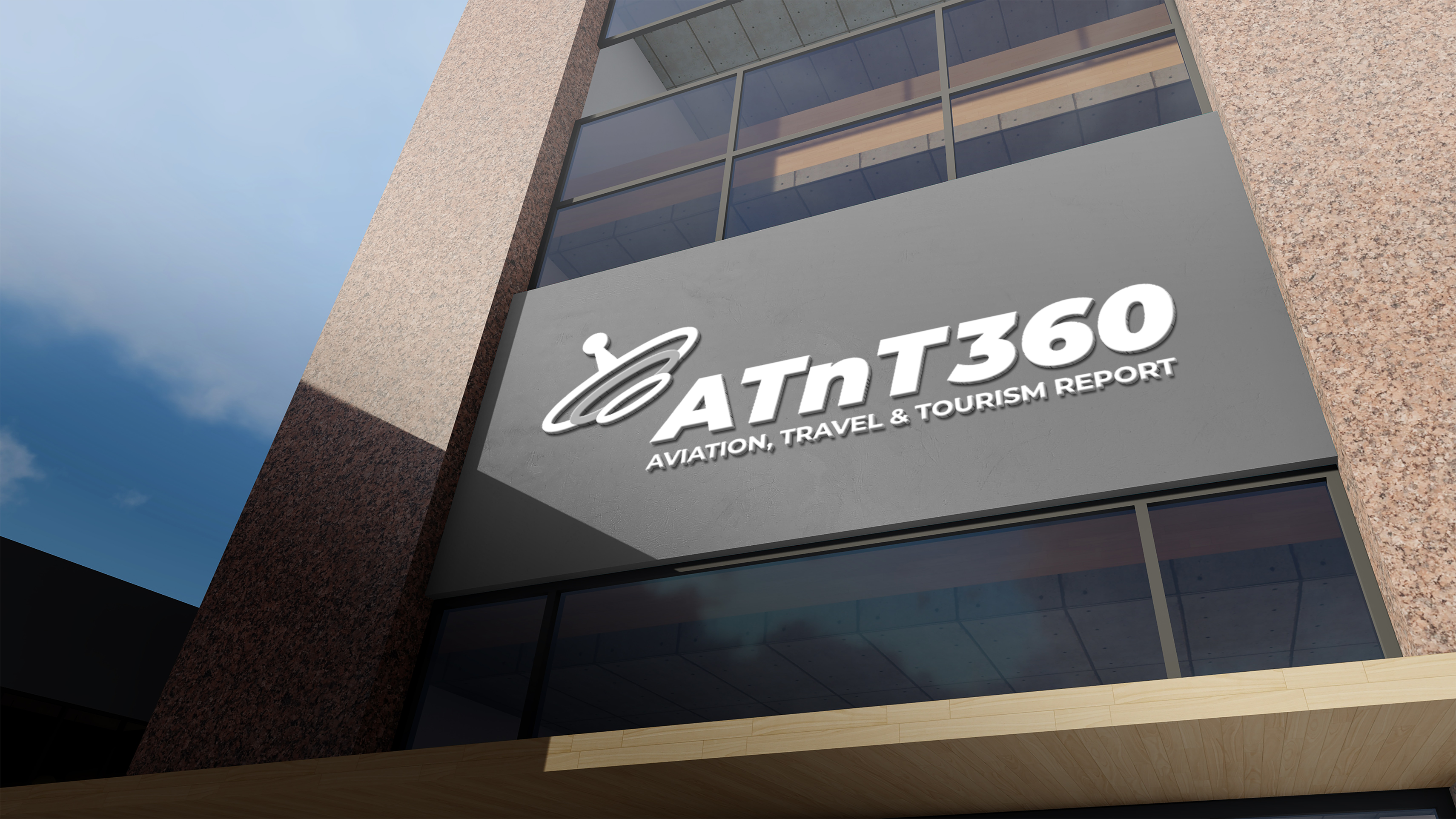
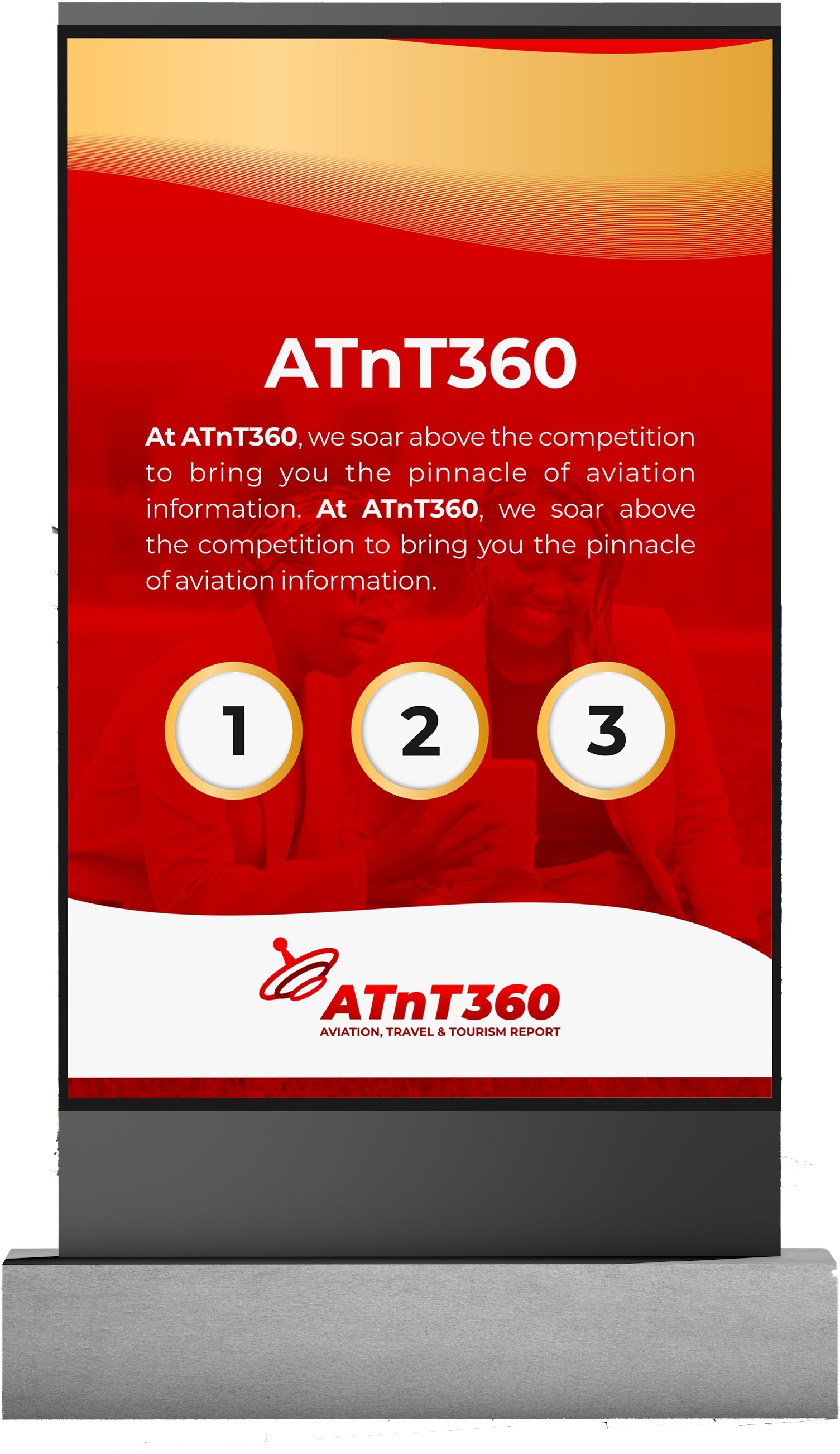
The mark: "ATnT360" in bold italic — italic for movement, momentum, things in motion. A satellite dish icon positioned above the wordmark, providing a direct visual cue for broadcast reach and global coverage without illustration. The "360" locks into the wordmark; it does real work, not decoration.
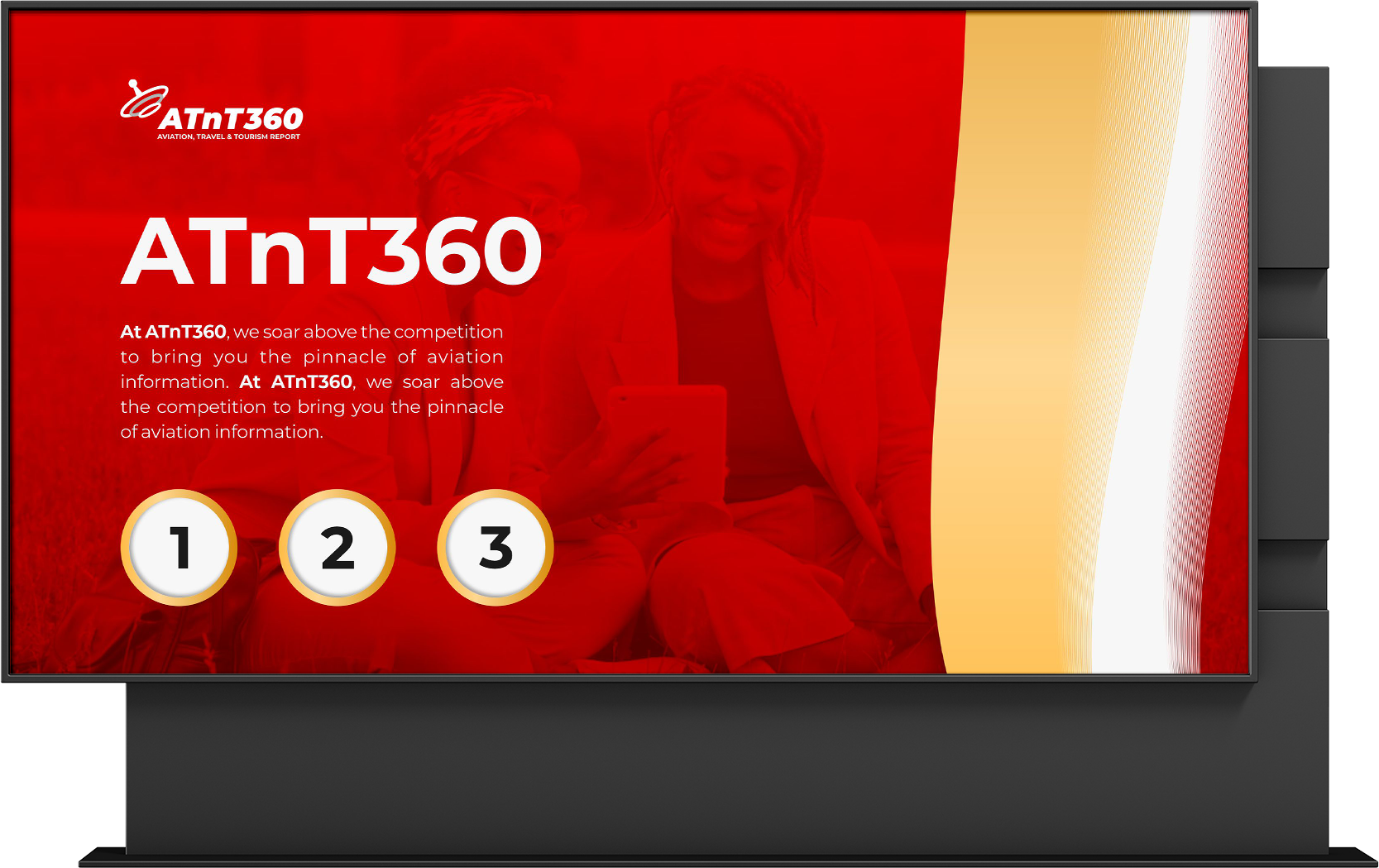
Strict typographic hierarchy: Montserrat Bold ALL CAPS for headers, Regular Sentence case for body, Thin Sentence case for metadata. Case rules enforce hierarchy across distributed teams — critical for a media brand producing content at volume. Bold Red as primary: broadcast authority. Gold Blend for premium contexts.
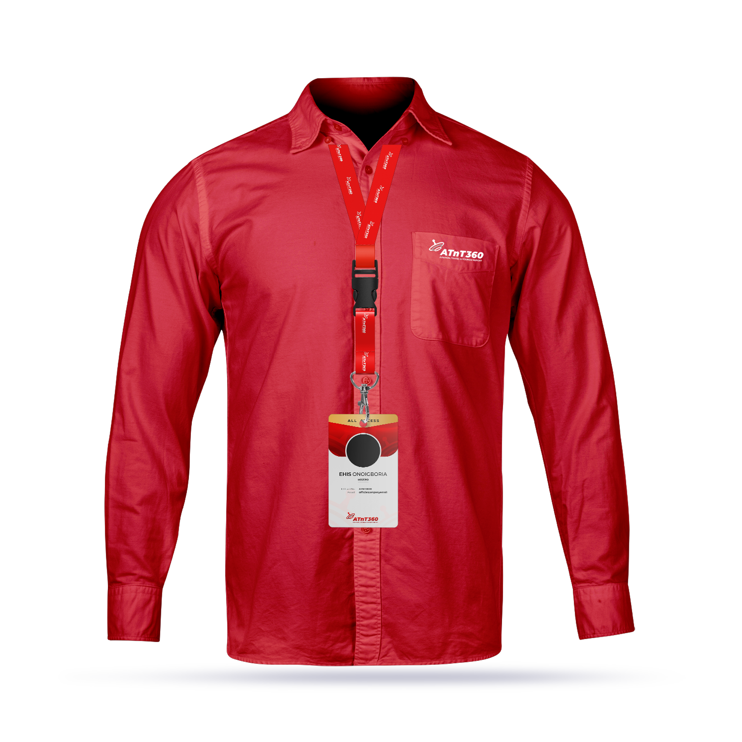
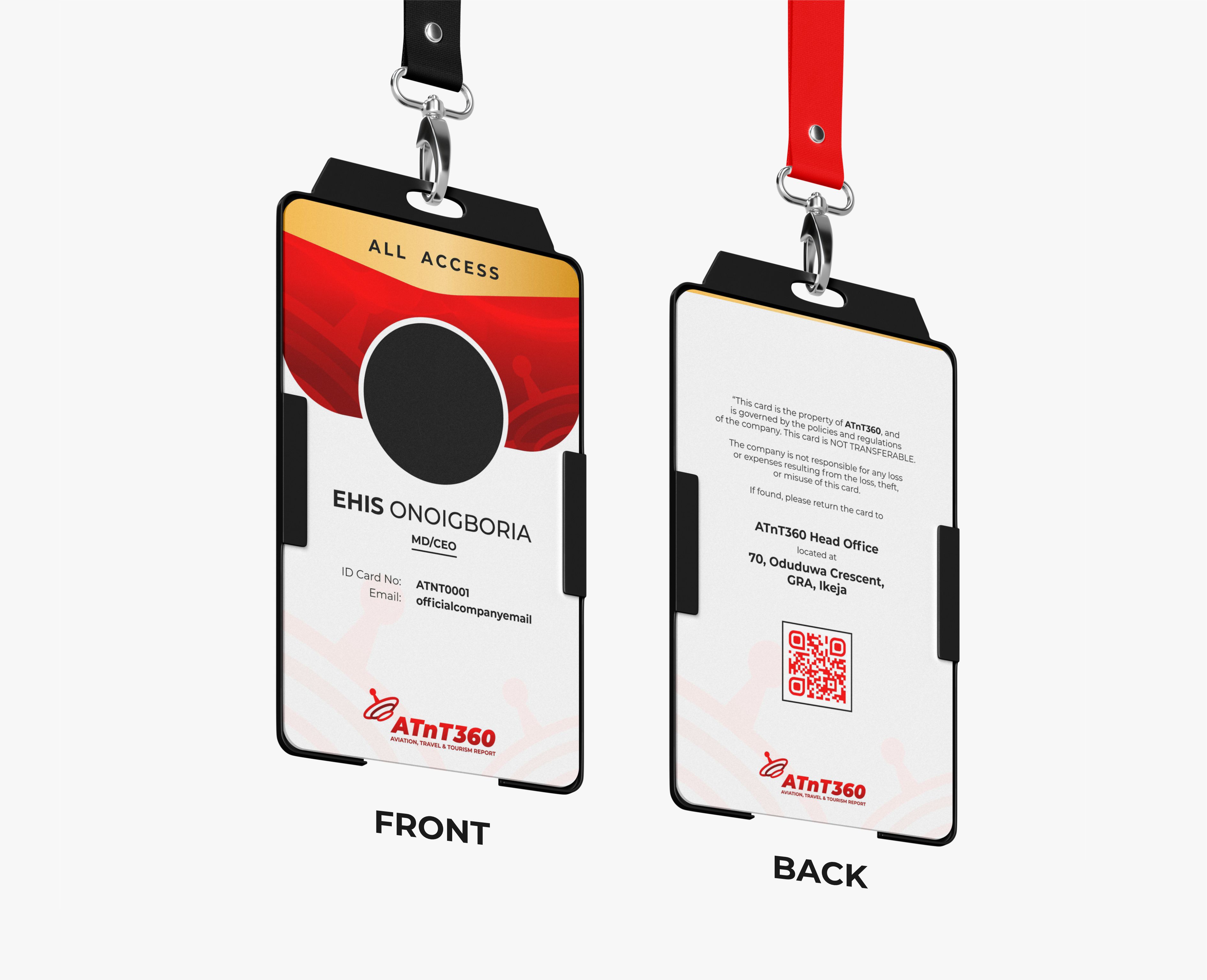
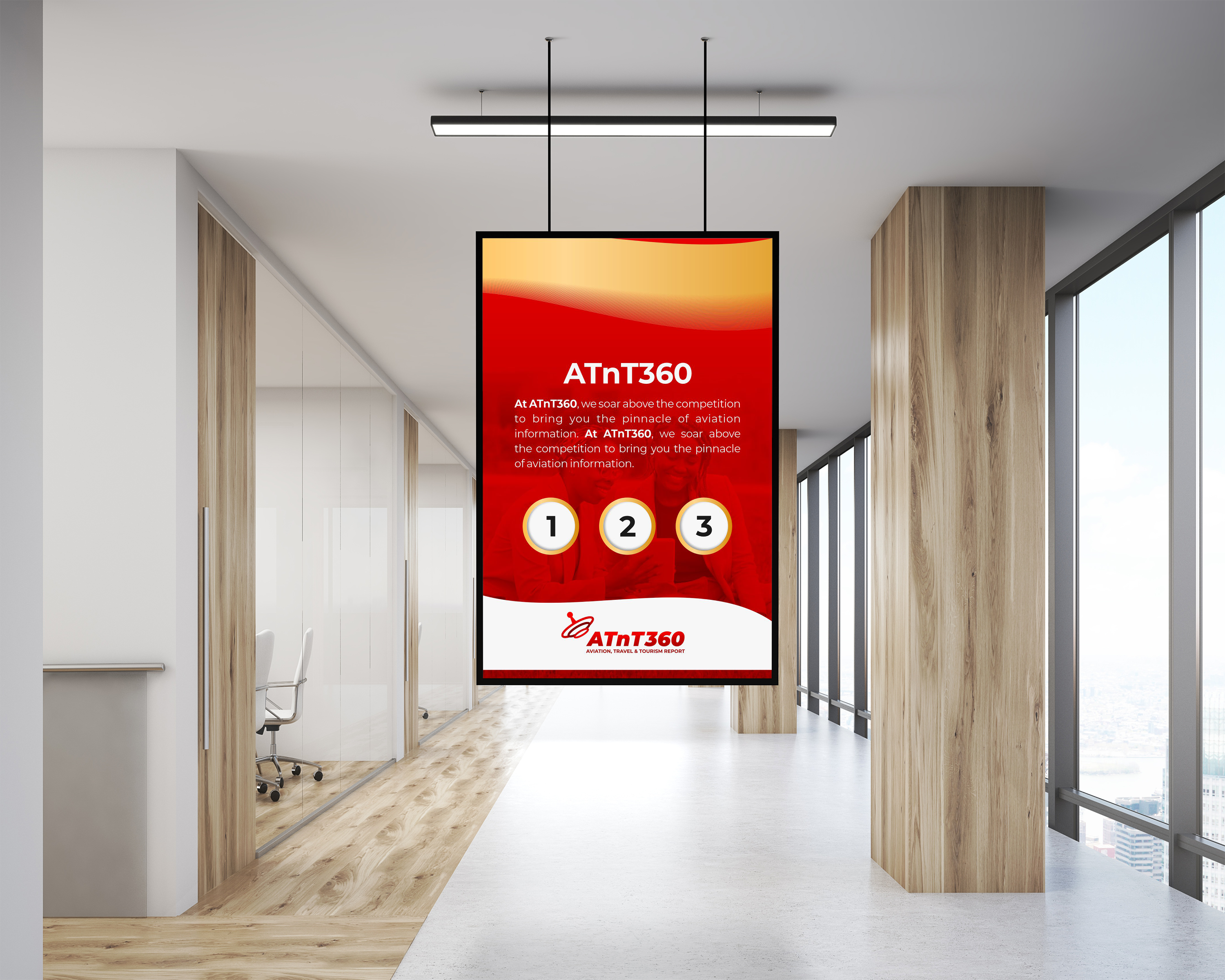
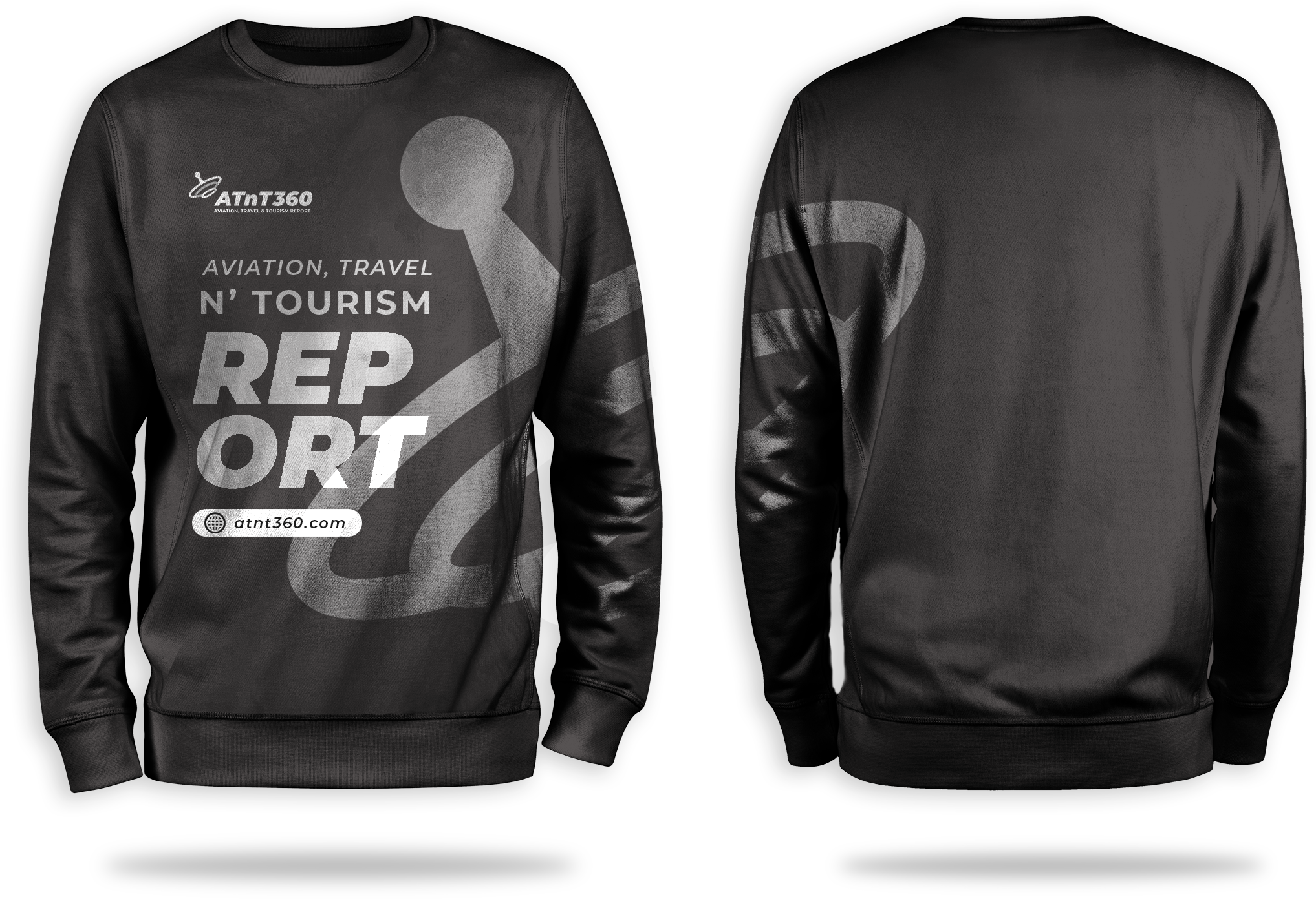
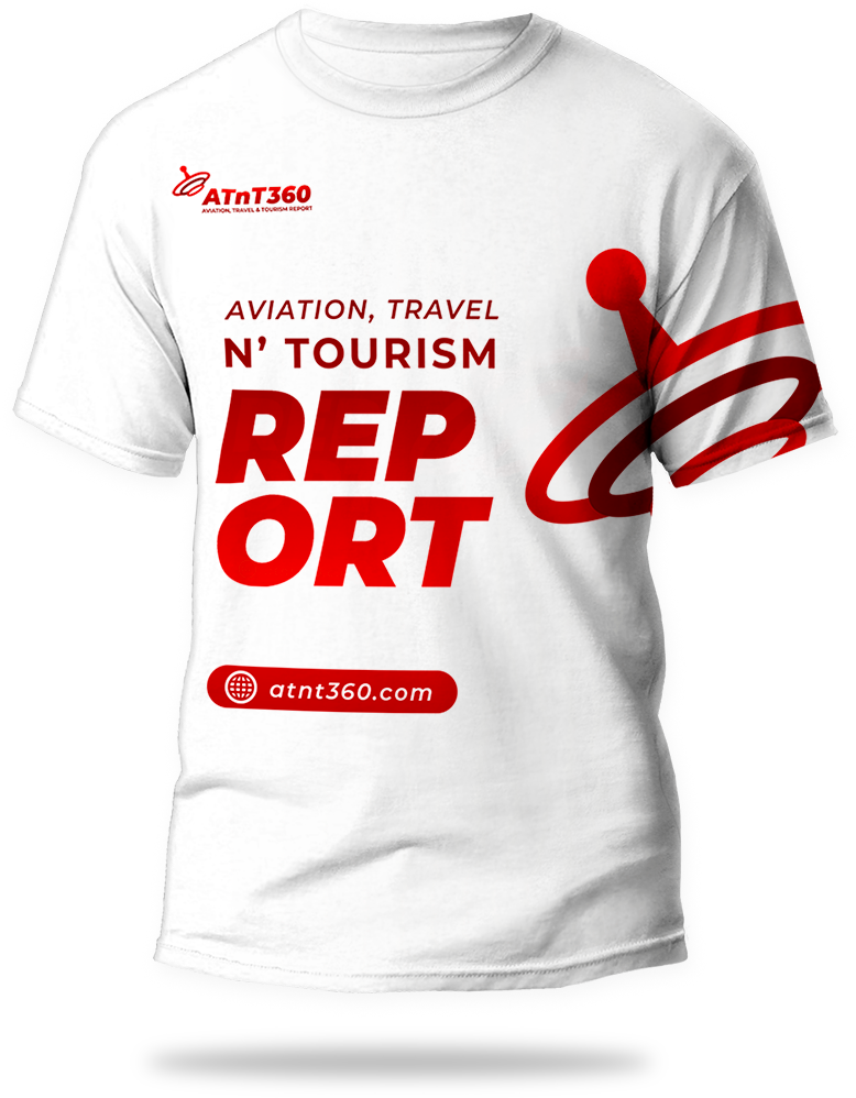
Transfer covered the full corporate identity: stationery suite (letterhead, envelopes, business cards, ID cards on branded lanyards), print collateral (trifold brochures, vertical and landscape billboards, editorial outdoor formats), apparel, and merchandise.
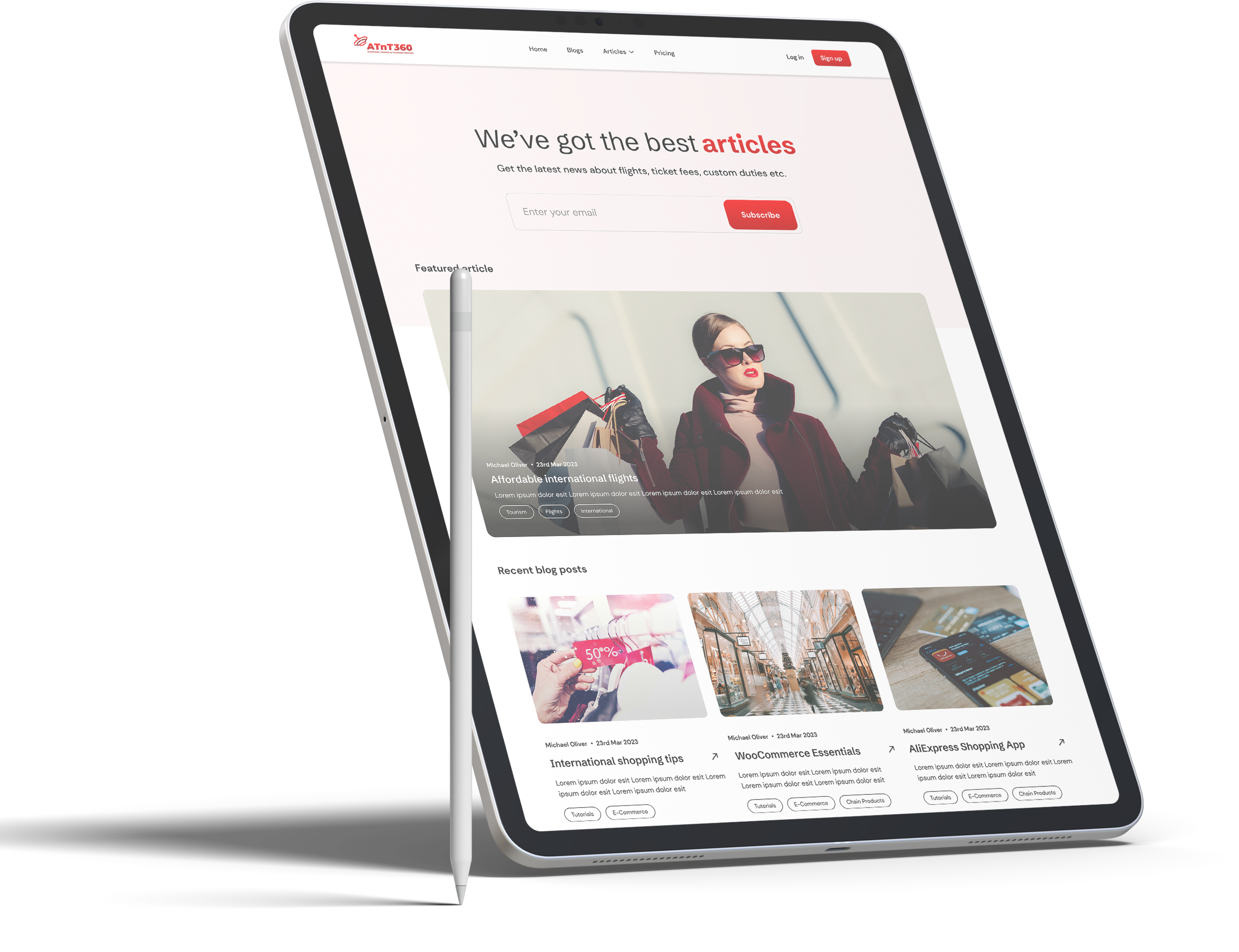
Digital templates were produced for web, mobile, Instagram, and video thumbnails for ATnT360 TV across YouTube, Instagram, TikTok, X, and Facebook. A complete brand manual with sizing guidelines, clear space rules, colour specifications, and typographic case rules for all future content production.

Media brands, corporate identities, broadcast systems. We build identities that hold at every scale, across every touchpoint.