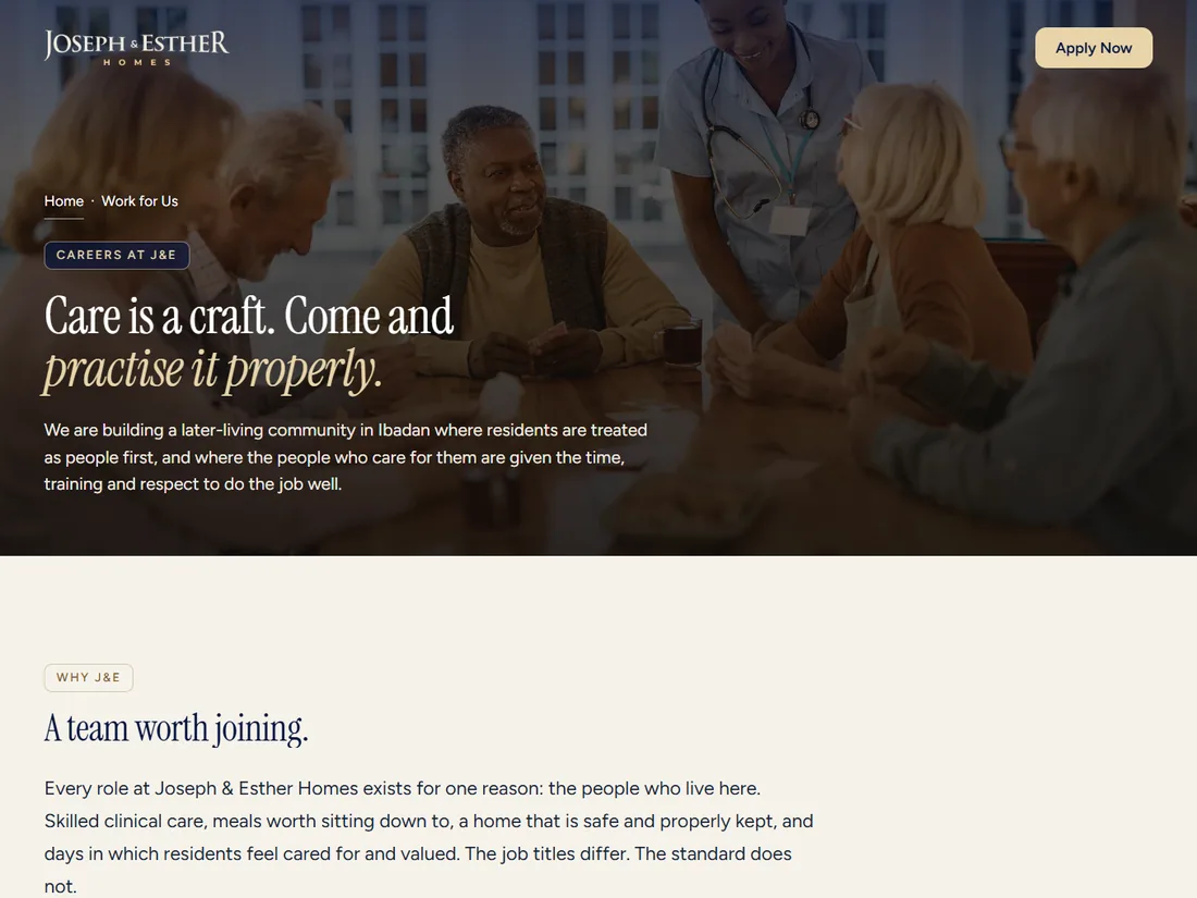
The Work for Us careers page on the Joseph & Esther Homes website

Joseph & Esther Homes is a premium retirement community in Ibadan. The website went live before the building was finished, which put it in an unusual position: it was not supporting an operation, it was standing in for one. It had to build the waiting list and hire the carers at the same time.

3
Month contract
7
Application fields
0
Monthly running cost
316
KB of code declined
The work

A site that had to do a job, not just exist.

01 The brief

Two audiences, and the harder one was staff.

The obvious audience for a retirement community's website is families: adult children evaluating somewhere for a parent, with a mixture of duty and guilt that the category usually answers with clinical whites and stock photography. The brand work had already resolved that, and this build carried it through to the web.

The second audience was the one with a deadline. Staffing a care home is the hard part of opening one. Carers, nurses, kitchen and housekeeping staff all had to be in place before the first resident arrived, and the client had no applicant tracking system, no HR software, and nobody technical to run either.

The easy version is a page saying "send your CV to this address". That produces a mailbox of unstructured attachments with no way to compare two candidates, and it is how small organisations end up hiring whoever emailed most recently.
02 The site

Hand-written, because the client should not inherit a maintenance bill.

The site is hand-written HTML, CSS and JavaScript with scroll-driven motion, deployed as static files. No framework, no build step, no content system to patch.

That was a deliberate handover decision rather than a technical preference. A small organisation that cannot maintain a platform ends up with an out-of-date platform, and an out-of-date platform is a liability rather than an asset. Static files keep working.

The visual language comes straight from the brand system: the navy and warm gold palette, the hexagon as the signature unit, Trajan for headers against a clear body face. The site reads as a continuation of the identity rather than an interpretation of it.

03 Recruitment

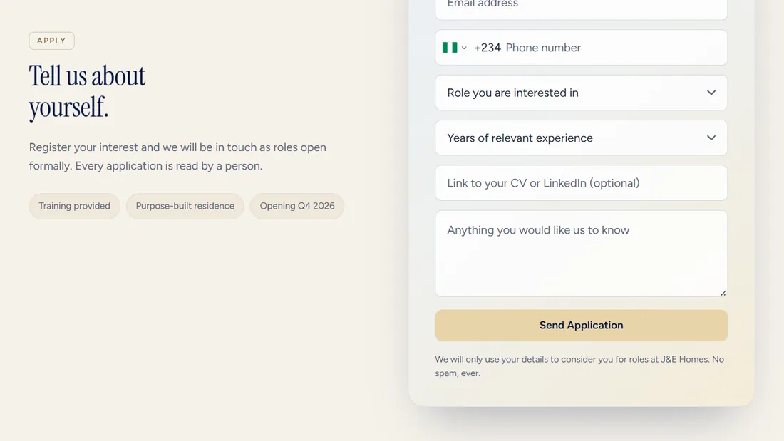
Seven fields, each one there to make a decision easier.

The Work for Us section lists the open roles, says what each one involves, and asks for exactly what is needed to sort a list of applicants. Every additional field is a reason to abandon the form, and in a market where most people are filling it in on a phone using paid-for data, that cost is real.

  • Name, email and phone. Phone matters more than email here, because it is how the client actually follows up.
  • Role applied for, chosen from a list rather than typed. This is the field that makes the whole dataset sortable, and free text would have destroyed it.
  • Years of relevant experience, as a band. A band is honest about its own precision and it sorts cleanly. A number invites people to round.
  • A link to a CV or LinkedIn profile. A link rather than an upload, which avoided a storage bucket, a file-size policy and a virus-scanning question for a launch that needed none of them.
  • Free-text notes. One deliberately open field, because a structured form with no room to say anything reads as a machine, and this is a job about care.
The Work for Us application form
04 Capture

A static site that collects structured applications anyway.

There is no server to receive a form submission, and adding one for a single form would have meant a runtime to maintain and secure for the rest of the site's life.

Submissions post to a Google Form through a hidden frame. The applicant sees the site's own form, in the site's own brand, with its own validation and success state. Underneath, the browser performs an ordinary form post into a frame it never sees, and the response lands in a spreadsheet.

That last part is the whole point. The client's team is not technical. A spreadsheet is a tool they already use, already trust, and can sort, filter and share without asking anyone's permission. A bespoke admin panel would have been a better demo and a worse handover.

  • No backend, no server cost, no form subscription. Three recurring obligations avoided for a client who needed none of them.
  • A real form post, not a background request. The tidier-looking approach fails on cross-origin rules, and it fails in a way that looks like success from the front end, which is the worst possible failure mode for a recruitment form.
  • Validation is enforced in the browser, where it can be explained to the applicant. A rejection on the far side would surface as a silent nothing.
05 Detail

It has to work for someone using a keyboard, on a slow connection.

Applications come from people at every level of confidence with a web form, including some who will never touch a trackpad. Validation messages are tied to their fields so a screen reader announces the actual problem rather than a generic failure, and on success the keyboard focus moves to the confirmation, so the submission is audibly confirmed rather than only visibly.

We also removed something. The telephone field originally used an international phone-input library, which would have shipped 316 KB of JavaScript for one field on a form where effectively every applicant dials from one country. It went, replaced by a plain input with sensible validation.

On a recruitment page, page weight is not an aesthetic concern. It is the difference between an applicant on a slow connection finishing the form and closing the tab.

06 Launch

Shipped properly, not just deployed.

A launch site carrying both awareness and hiring needs to be findable, and needs to stay findable, so the production configuration was part of the work rather than an afterthought.

  • Canonical redirects, so one page has one address and search engines do not split its authority.
  • Compression and long-lived asset caching, which is what makes a repeat visit instant.
  • robots.txt, sitemap, favicons and social preview images, so a link shared in a WhatsApp group renders as a real organisation rather than a bare URL. For recruitment in this market, that preview does more work than the search ranking.

The site launched ahead of the building and carried both jobs on its own, which was the requirement it was actually built against.

What it runs on

The stack.

Build
Hand-written HTML, CSS and JavaScript. No framework, no build step, nothing for the client to patch
Motion
GSAP with ScrollTrigger, reduced-motion preferences respected
Capture
Hidden-frame form post to Google Forms, responses landing in a spreadsheet the team already knows how to use
Accessibility
Errors associated with their fields, focus moved to the success state, no library shipped for a single input
Delivery
Static hosting, Apache configuration, canonical redirects, compression, long-lived asset caching
Next project

J&E Homes brand

View case study