Brand IdentityPackaging
The bottled water category in Nigeria defaulted to aggressive label design, unverifiable superiority claims, and price-competition framing. Discovery established the real gap: no brand had chosen restraint. No brand had said, through design alone, "this is the premium option" — without shouting it.
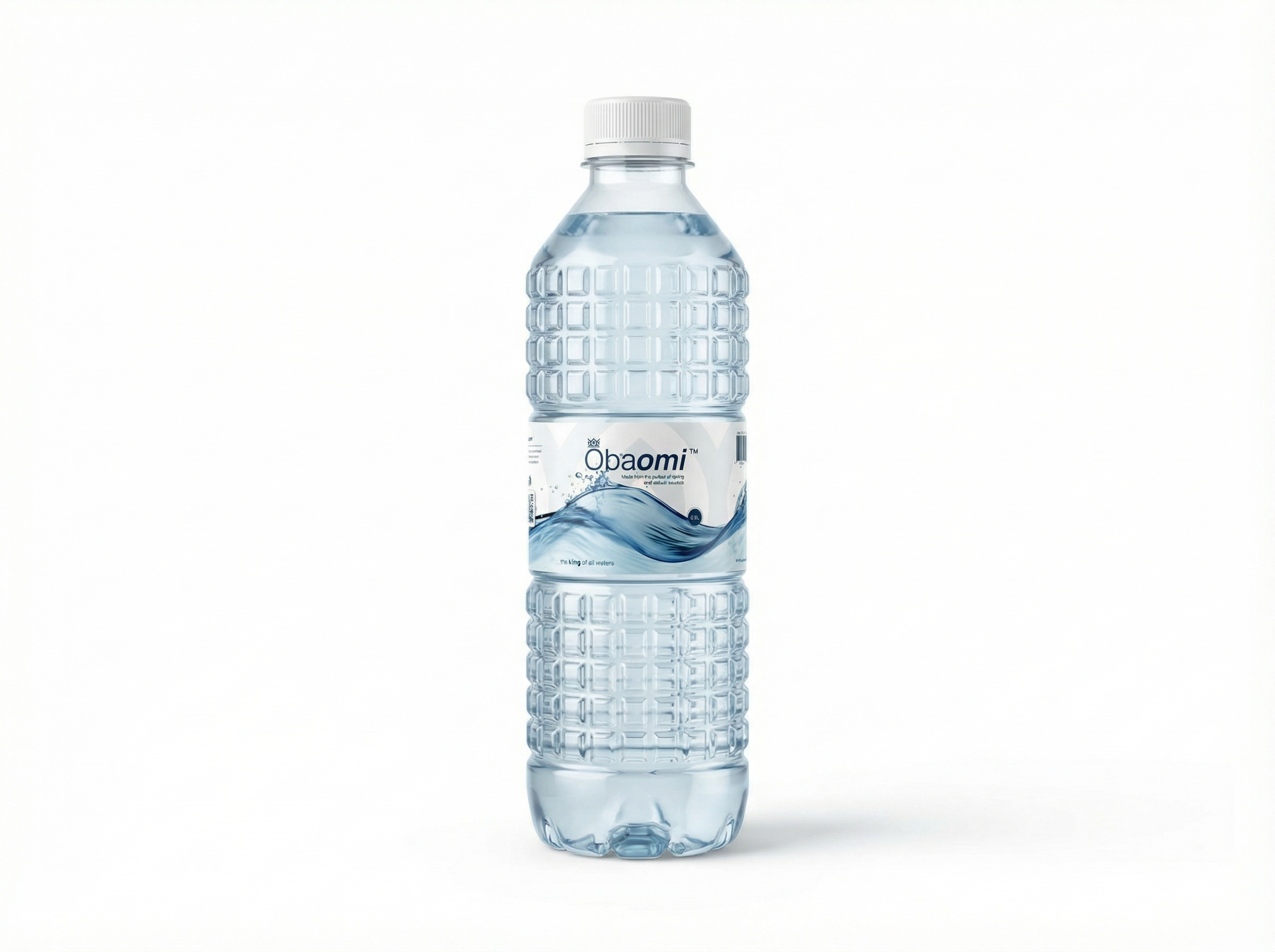
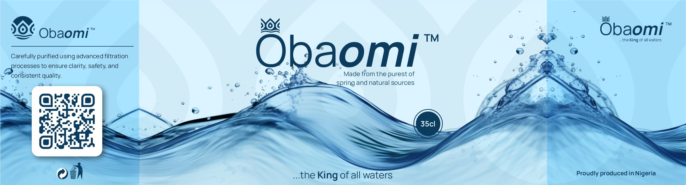
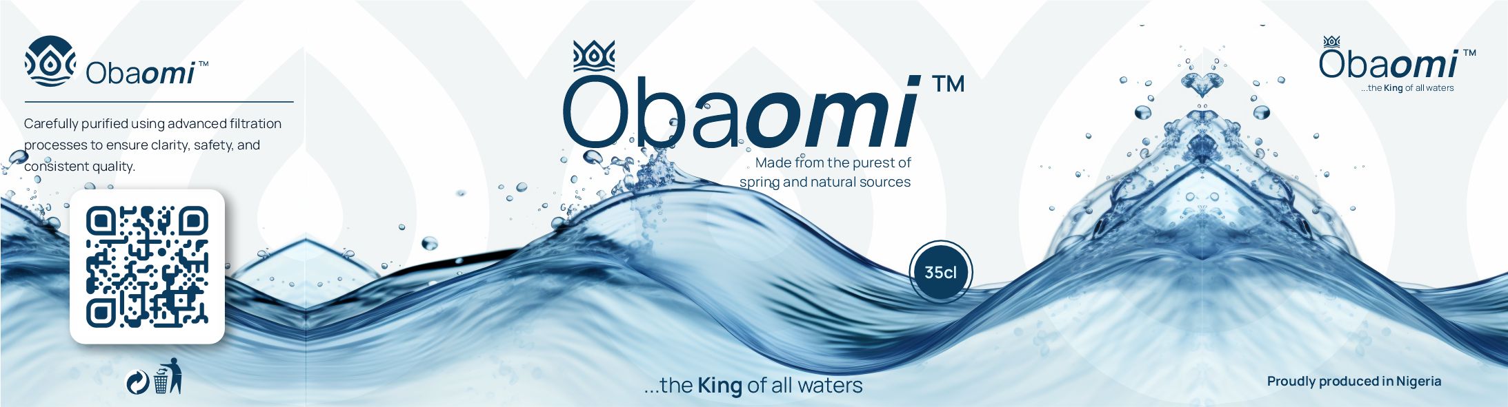
The name itself was the foundation: Oba (king in Yoruba) + omi (water in Yoruba) = King of Waters. The brand had to earn that name through design, not slogans.
The Architect phase produced the brand operating system. Positioning: Obaomi is the deliberate choice — not the fallback, not the imported brand, not the cheapest option. The target consumer: the educated, aspirational Nigerian who reads product quality through packaging quality.
Core principle: compliance as craft. Nigerian advertising regulations prohibit unverifiable superiority claims — so the brand had to communicate premium through design, not copy. Empty space does heavy lifting. The restraint is the message.
The mark: three teardrops rising above two undulating lines. A quiet abstraction of the Yoruba royal crown, built without ornament or filigree — only the geometry of water. The wave anchors the crown and suggests both a still pool surface and the motion of a poured drink. Symmetry as confidence.
Wordmark: "Oba" upright and rounded (solid, grounded — the king). "omi" italic, lighter weight, aqua blue (fluid, flowing — the water). A single detached dot above the i, shaped like a falling drop — a detail for those looking closely. Tagline: "...the King of all waters." The ellipsis is deliberate: an understatement, a confident half-smile, not a declaration.
Transfer delivered the full production package: print-ready 35cl label artwork in two variants (Deep Ocean Blue and white/sky-blue), at correct dimensions and colour profiles for print. Complete logo suite in all variants — full colour, reverse, monochrome — with construction rules and clear-space specifications.
Brand guidelines covering the colour system (Deep Ocean Blue, Aqua Blue, Soft White, Light Silver), typography direction, packaging specifications, and photography direction. Obaomi now has everything needed to maintain consistency across every production run — from a single SKU to a full product range.
We build packaging and product brands that make the premium positioning visible before the product is even opened.